Graphic
Design
Illustration – Branding
Rolas Parleras: A Podcast Journey
Rolas Parleras is a podcast project I’m developing alongside an anthropologist friend. For this project, I’m in charge of the entire graphic line. The podcast’s representative image is inspired by the old signs displayed on the front windows of Bogotá’s buses to indicate their routes. I adapted this classic design to include key information about the podcast, such as its name, season number, and the episode’s title and number.
The design also features an illustration of the Eastern Andes Mountain Range, which runs through the city, alongside the silhouettes of Bogotá’s iconic landmarks, such as the Colpatria Tower and Monserrate Sanctuary, creating a unique visual connection to the urban context of the capital.
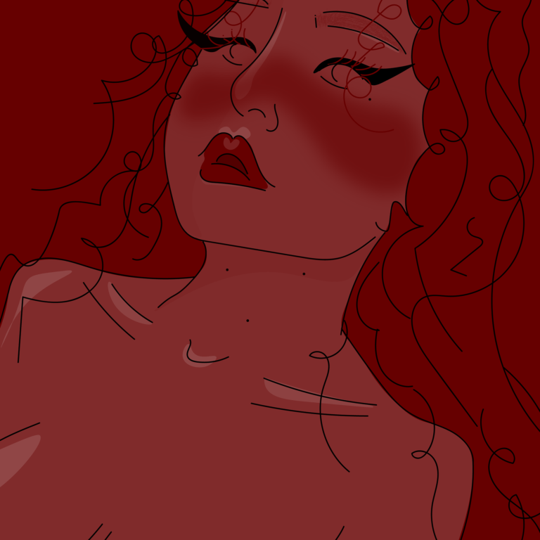
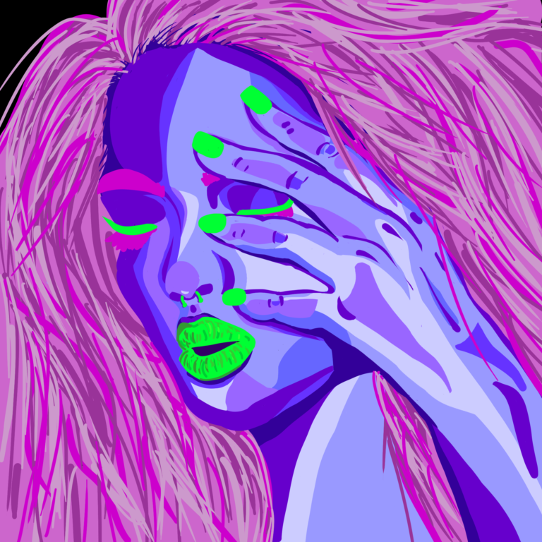
Contrasting Girls: Minimalism and Detail
I’ve always been a fan of drawing and creating illustrations. Here, I share two drawings of two girls created using different techniques and tools.
The red illustration was designed with the aim of achieving a visually appealing piece using minimal elements. Simple lines and a limited color palette for highlights and shadows add a minimalist touch that contrasts with the intense red of the hair, cheeks, and lips.
In contrast, the purple illustration is a detail-rich piece with a bolder approach. It uses highly saturated complementary colors: purple for the skin, pink for the hair and body hair, and green for the lips, outlines, and nails. Various tones of these colors were applied to highlight, shadow, and create depth in the composition. An additional challenge for this piece was avoiding any blending, relying solely on defined strokes to achieve the desired effects.
Graphic Identity Design for Maloka
Maloka, an Innovation and Entrepreneurship campus located in Antioquia, draws its inspiration from traditional Amazonian malokas—spaces where knowledge connects with people. I was responsible for the comprehensive design of its graphic line and the creation of its brand manual, ensuring a coherent visual identity aligned with the institution’s values. The logo, featuring a maloka icon, is designed in orange to convey dynamism, creativity, and alignment with the innovation and entrepreneurship ecosystem.
Brand Manual for Región Deluxe
The development of the brand manual for Región Deluxe focused on conveying exclusivity and elegance, the core values of this luxury property brand. The logo design incorporates the Arbacco tree as a representative symbol, a species native to Latin America that reinforces the idea of rarity and exclusivity, key elements of the brand. The use of gold in the logo design enhances these attributes, while gradients add a modern and sophisticated touch.
The color palette includes warm gold tones, complemented by blue gradients that strengthen the connection with related brands. Finally, black is used as a neutral tone to balance the composition and provide a sense of sobriety to the visual identity. This brand manual ensures consistency and clarity across all graphic elements of Región Deluxe.


